


#30DayChartChallenge Retrospective

On the 1st of April, I was twitting about Twitter and noticed some data visualizations in my feed with the hashtag #30DayChartChallenge. Instantly intrigued, I decided to participate without thinking about the bazillion things I already had going on in April. I was excited to expand my portfolio and to explore some datasets I had been collecting for later analysis and visualization.
Approach
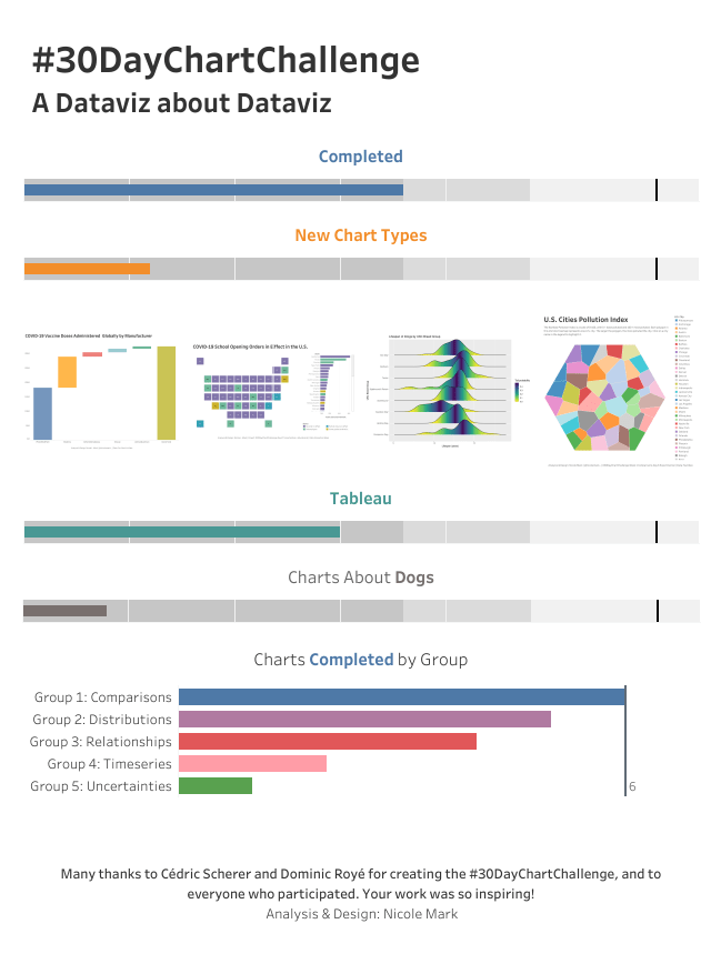
In retrospect, I wish I had developed a strategy for creating 30 new charts in 30 days that involved a set amount of time I could spend on each viz (say, an hour or 90 minutes) and limitations on data finding, exploration, cleaning, and analysis. I did set two goals other than actually completing all 30 charts (which I did NOT do), though, and managed to accomplish both.
Use a tool other than Tableau for at least one of the charts.
I used R/ggplot2/ggridges for one viz, Excel for one viz, and Flourish–a tool that was new to me–for another one.
Make at least one chart type I had never made before.
I created several chart types I had never attempted. I felt free to explore and experiment, so I made a waterfall chart, a Voronoi treemap, a Ridgeline plot, and a sunburst chart!
On May 1, I tallied up my chart output and I had 18. Of course I made a chart about my charting.
Visualizations
I didn’t complete all 30 charts, partly because I obsessed over datasets for hours instead of just choosing a nice clean one and getting vizzy. I was thrilled that I remembered enough R to create the ridgeline plot below of the lifespan of various dog breeds by United Kennel Club (UKC) breed group. I used ggplot2, my favorite dataviz package for R, and ggridges, which was new to me.

For Day 12: Distributions – Strips, I made a waterfall chart in Tableau for the first time (with some help from this fantastic tutorial from Ryan Sleeper).

For the Tampa’s Palm Trees viz (Day 16: Relationships – Trees) below, I used a new tool (Flourish) to create a new chart type for me, a sunburst chart. Flourish proved very easy to use and has a built-in template for this chart type. (In Tableau, it would have involved a bunch of calculations. At some point I’ll tackle that challenge!) It was also very easy to embed the interactive version of the chart in WordPress.
COVID-19
While the topic of four of my vizzes was dogs (duh), I created three vizzes about COVID-19. (All are viewable on Tableau Public, here, too.)
For Day 7: Distributions – Physical, I looked at Florida’s administration of the COVID-19 vaccine.
For Day 23: Timeseries – Tiles, I explored the variants of the virus circulating in the U.S.
For Day 27: Uncertainties – Educational, I ended up creating this tile map showing the COVID-related school opening orders in effect in some U.S. states. I found a dataset from the State of Maryland with COVID outbreaks in schools, but after spending way too much time cleaning it, I abandoned that idea.
All told, I had a lot of fun and learned some new techniques and tools. I look forward to doing it again next year!