


Meet the DataFam 04: Emily De Padua
She contains multitudes.

Hey, reader! Happy Friday! If you’ve read Meet the DataFam previously, you know how it works. I usually include an explainer at the beginning, but since I decided to put all the Meet the Datafam posts in one place online, I put my explainer on the same page.
Now you can access all the previous (and future!) installments of Meet the DataFam here, and learn a little more about the folks I’ve interviewed, too.
⏪ The Background
Every once in a while, someone crosses my path who I like INSTANTLY. Emily De Padua is one of those people. Like most of the DataFam I know, I met her on Twitter. Emily’s authenticity and enthusiasm for everything data are infectious. Her tweets and DMs make me smile on the regular. I’ve gotten to interact a bit more with Emily since I started Women in Dataviz, and we’ve discovered we have kind of a lot in common.
🌈 The Viz: Color Studies
Color Studies was Emily’s IronViz Qualifier entry last year — the theme was “visualizing the arts” — and it’s spectacular. Some time ago, I heard a guest on a dataviz podcast (of course I cannot remember who or which podcast it was) talking about “data experiences” as the future of data visualization. The speaker mentioned data sonification, too, I recall.
Color Studies is a data experience, not a dashboard. It’s an audiovisual celebration of photography, music, art, and data, and also of the friendship and collaborative process between Emily and Chelsea, the photographer. The charts — ternary plots — are beautiful, but they are only part of the overall experience. The image below is a collage of screenshots and doesn’t capture this project adequately, so please go check it out on Tableau Public if you haven’t previously.

The 21 photographs in the viz were taken by Emily’s friend, photographer Chelsea Pineda, during her time as a concert photographer around New York and Philadelphia from 2016 to 2019. Emily narrated a 20-minute listener’s guide to accompany the viz. As she explains, she extracted the hexadecimal — or more commonly, “hex” — codes for all of the colors in each photograph and converted them to the RGB values. Ternary plots work great for plotting three distinct numerical values, and if you understand that RGB values represent the intensity of red, green, and blue light in the color being plotted. So if you were to look up the RGB value for pure blue, it would be (0, 0, 255), the highest value for blue, with values of 0 for red and green. I could go on, but I’ll leave the rest for you to explore.
🙋🏼♀️ The Questions
Where are you from originally?
I was born in Philadelphia, Pennsylvania. When I was around 2 years old, my family moved outside the city to South Jersey. I think it’s really funny that for someone who had those lofty high school dreams of running away from her hometown and applied to schools that were at least 2 hours away, I ended up going to the university that was a solid 15 minute drive away from home. Hilarious!
Where do you live now?
In October 2017, I took a role that was located in New York City, and moved to the North Jersey side of New Jersey that was commutable to New York City. Now that I work remotely, I mostly split my time between my apartment in North Jersey and visiting or staying with my parents in South Jersey (shout out to their in-unit washer and dryer). I like to joke to people that originally sticking to New Jersey was a way to avoid additional paperwork (and a way to prolong entering adulthood), but now I’m just really committed to living in New Jersey for as long as I possibly can.
Where would you live if you could live anywhere (assuming things like money, family, and work location are not a concern)?
Oh gosh, could you imagine if I could somehow get a house just like the one from Practical Magic? Wow, that might be the new dream. A beautiful home with a garden, by the ocean, and I’m sure I could have a cute art studio for all my crafting and pottery dreams. It would be right by a cute downtown that the film implies is pretty small business driven (my favorite type of downtown!). And even better if this theoretical Practical Magic type house for me was near a very accessible public transportation and a major city.
Nicole’s note: I imagine this little downtown being like Stars Hollow from The Gilmore Girls.
Do you have any pets?
Hello, meet the one true love of my life, Kuya Pancit. Kuya Pancit is a shih tzu mix (we think shih tzu and Havanese) that we rescued as a family in May 2021. My dad texted me a picture while at the animal shelter and it was the singular best text of my life. Kuya Pancit, or KP for short, was named because we always wanted a brother growing up (“Kuya” is used for your older brother / cousins / brother figures) and we love pancit (a popular Filipino noodle dish).


Kuya Pancit is the love of our lives. The second photo is of my parents, my sister Marianne, Kuya Pancit, and me. Oh gosh, I love Kuya Pancit so much.
Did you start your career in a data-related role or in another field? If another field, which one?
Oh, I definitely did not start in a data-related field. I proudly earned a Bachelors in Music Performance at Rowan University. I seriously loved playing the flute so much that I was determined to go to music school (on a scholarship!!) and get a music degree. A valuable lesson to learn though is that sometimes, the very things we thought we always wanted can change. Growing up, I always wanted to go to music school, I wanted that music degree. I loved studying music and I loved playing the flute.
But once I got the very thing I was so determined to get, it just hit different, ya know?
I look back on that time quite a bit with a special fondness because I am grateful for the ways I accidentally ended up in data. While in music school, I was getting academically antsy (sorry, music school, it’s true, I needed to get out of the music building!) and started taking a bunch of public relations, marketing, and even a graphic design course! I didn’t know what I wanted to do but I was following the lofty advice people often give, “Creatives need to be able to run their own business.”
When I was a sophomore completing an assignment for a marketing class, I got to interview the Marketing Technology Manager of Opera Philadelphia. In the thirty or forty-five minutes it took to complete the interview for my assignment, not only did I get an introduction to Google Analytics and the role it plays at Opera Philadelphia, Lauren Ancona ultimately gave me a kind of roadmap for what I could possibly do with my music degree if — more like when, as it turned out two years later — I finished music school and wanted to take a different path. At the time, I was starting to do a bunch of on-campus jobs like being an office assistant for the commencement planning office and helping the music school out with their social media platforms and student admissions support. (I swear this all has a point to how I got into data.) The social media job was right around when Facebook was offering analytics and I remember relying on Facebook Analytics quite a bit because I was essentially a one woman social media team (lol).
Ultimately, when graduation time came and I really committed to not pursuing music after graduating — a series of events that included failing to get through any of my grad school auditions really helped accelerate that grieving process for me) — I thought of Lauren Ancona. Because even if I didn’t quite know what I would do or if I would do exactly what she does in her career, I had the comfort that I will figure it out, that I will manage. I did not feel like I was doomed for failure because I knew of Lauren Ancona. And when I was a sophomore during that marketing assignment interview, Lauren had mentioned a full-time internship program at this giant botanical garden, Longwood Gardens, that she mentioned helped her in her post-college career transition. She described the Longwood Gardens internship as a full-time, entry-level job that taught her a lot of great things in the fields of marketing and graphic design. As a senior, on a whim, I looked it up and…saw the deadline to apply was in less than a week away (and during my university graduation week)!! After very narrowly getting my application together, I interviewed and ultimately landed the very same internship Lauren Ancona described to me, and she was right–I learned loads in this post-college career transition. The internship was a lot like an arts administration internship, because I worked in the gardens’ concerts and events department which booked the artists for any concerts and big events hosted in the gardens. I learned tons during my internship at Longwood Gardens from [how to execute] email marketing campaigns to website management and audience segmentation to artist management and reviewing contracts and (pay attention to this) assisting in the rollout of a brand new in-house ticketing system! My personal favorite was the rollout of the in-house ticketing system because it ultimately got me interested in ticketing systems.
What I didn’t realize until after I got to the botanical gardens was that the internship program was essentially geared to horticulture students. Which meant most professional development opportunities for interns were (you guessed it!) in horticulture. In hindsight, this was very obvious to most (several of my cohort were like, “are you kidding me?” when I shared that I was so surprised), but I was completely clueless. I’m not a particularly outdoorsy person, and I couldn’t tell you much about plants (I’ve gotten better!). So for me, a good chunk of the professional development opportunities offered through Longwood Gardens would be me tagging along on any garden trips. (Did you know that Philadelphia is the garden capital of the U.S.? There are 25 gardens in a 25 mile radius.) One of those trips was for a turf management lecture at the Phillies and Eagles stadium (no, seriously). Oh! I was beyond confused during the Phillies lecture because it took me a solid 15 minutes to realize the Director of Horticulture was talking about Kentucky Bluegrass, the grass, not the music genre. Embarrassing. Never gonna live one that down!
But it was the Director of Horticulture at the Eagles stadium that ultimately pointed me in a direction that (finally!) got me to data. During his lecture, he mentioned sports stadiums were hosting events more frequently as opposed to hosting exclusively sporting events. My ears perked up because not only was I towards the end of my internship, I was very interested in ticketing systems and audience segmentation (because Longwood Gardens had just implemented a brand new ticketing system for their live concerts!!).
So, I started applying for sports ticketing analytics jobs. It is really important to say that I was pretty clueless on sports. I joke a lot that a big plot twist for my Dad, a big sports lover and avid tennis and pickleball player, was that the daughter that hated anything athletic that he had to drive to orchestra rehearsals and auditions ended up in sports. But I wasn’t so worried about trying to make sense of how to fit in the sports landscape (at the time, later would be a different story), because I wanted to learn about ticketing systems and understand how to help get fans–whether fans of a soccer club, fans of a band, or fans of a specific type of flower installation at a botanical garden–closer to what they love. I eventually landed my first data analytics role at the Philadelphia Union where I was a Business Analyst. I hold a lot of love for my time at Philadelphia Union, because this is where I was taught the foundations of nearly all of the data skills that I have today, like Excel, SQL, and “a really powerful tool” (quoting my manager and now cherished mentor, Kyle Mathiot, here) called Tableau. I remember hearing the name Tableau and instantly liking it because the name reminded me of a [French composer Maurice] Ravel piece.
Anyway, that’s how I got into data.
If you had to choose a different career path, what would it be? Why?
I like to imagine an alternate universe where I did ultimately stay in music. I don’t know if I would be as fulfilled as I am now and I only have (now) a vague inkling on what that life would be like, but it’s a fun fantasy to have nonetheless.
Honestly, if I had to choose a different career path, it would have been cool if I got to be some kind of blacksmith or ceramicist. I like building things in general, especially with my hands. Like you should see how ecstatic I get whenever I have to tackle a home DIY projects–every floating shelf in my apartment was installed by ME! Suffice it to say that if there’s some kind of career where I could keep crafting and get paid for it, I would be so game. I like being in positions where I’m constantly learning new skills or getting to experiment with the way I create and build things. I like being challenged to build something against a new set of parameters, and getting to iterate over and over again on the design. I think this is why I especially love trying to break my own dashboards, because it’s so satisfying when you find bugs (because you know you’re doing the work) OR when you send your dashboard to someone else and they do NOT find a bug (again, because you did the breaking yourself).
NN-Would you like to come to my place and install some floating shelves?
What is your favorite Quick Table Calculation and why?
Percent of Total. It’s so specific, but I remember when I was learning Tableau and appreciating it right away, and my favorite part is all you have to do is highlight all the rows and you can tell right away if you’re adding up to 100%.
Close second is Percent Difference From because when I started out in Tableau, I regularly had to write down the formula for growth on a Post-It note when checking my math. Who knew
([New Value]-[Old Value]) / [Old Value]
would be such a big staple in our data lives??
NN — For those keeping score at home, that’s 75% of Meet the DataFam guests so far that have chosen Percent of Total.
What do you find the most challenging about Tableau?
That there are 6 different ways to do the same thing in Tableau and all 6 ways are valid. It’s less about, “Is this the right way?” and more, “Is this the most efficient solution for what I need solved?”
What do you like most about Tableau?
That there are 6 different ways to do the same thing in Tableau, which means anything is possible if you can find the way. And if one solution doesn’t work, there’s another iteration somewhere that could fix it.
NN — This is something I like about Tableau, too. But yeah, to find the optimal solution for your particular use case–especially for a company like mine where we deploy the same dashboards for all of our clients whose data look very different — can be a true challenge. There are always tradeoffs–a little more load time for this aesthetically pleasing but ultimately unnecessary widget?
If you couldn’t use Tableau, how would you do data visualization? (e.g., coding language, other BI tool, draw it on paper or digitally, wouldn’t do it at all, etc.)
Oh! I hate to think of that alternate timeline where I couldn’t use Tableau. I’m so fond of Tableau because it was one of the very first tools in my fledgling data career that I felt so confident using and gave me that, “Okay, maybe I’m not crazy, and I can do this!” kind of beliefs. I think it would have been neat if, in another life, I learned a coding language to do data visualization. I don’t know how much of it would have stuck or how it would have netted out, but I like to think it would have been a real neat alternate universe.
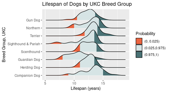
NN–It doesn’t have to be an alternate universe. Coding dataviz makes me feel accomplished, and sometimes I can get a chart type built easily that would be hard in Tableau. (Like this ridgeline plot below. Less than five minutes in ggplot2 with the ggridges package. And I customized the colors.)
What is your favorite chart type? Why?
When I first got into dataviz, I loved flashy charts like sankeys, radials, and ternary charts. But honestly? You can’t beat a good bar chart. Or a really well laid out scatterplot. When I first got into Tableau, I was so enchanted by all its capabilities for interactivity and formatting and so many different charts. But so much of my work is the foundational bar charts and line charts, and you really can’t beat it. My latest challenge is figuring out how to dress up your standard table, my usual go-to is to add sparklines.
NN–Agreed. I still enjoy the flashy charts, but for the day-to-day of real analytics meant to communicate with real business people, a chart they can understand and glean insight from is key.
Which community challenges do you regularly participate in? Why would you recommend them to new members of the Datafam?
Oh!! Admittedly, there’s room for improvement on my end at regularly doing community challenges, and that is something I’m hoping to change this year. I have to give this honor to my all-time favorite that has always taught me new things in a pinch which is #WorkoutWednesday. I love it because it’s an objective challenge — “Can you remake this very viz just by looking at it?” — it usually uses Superstore data [this is Tableau’s sample data that comes with the software], and it’s very technical. As someone who learned Tableau primarily by downloading, dissecting, and reverse engineering whatever I discovered in Tableau Public, I really appreciate a very direct technical challenge like that.
NN–I don’t have many regrets regarding my dataviz learning path, but one is that I didn’t do (and still don’t!) Workout Wednesday regularly. It seems like every time I have difficulty building something in a business dashboard at work, there’s a WOW that would’ve taught me how to do it, like 2 years ago.
What hill would you die on?
All professional astrologers are occult data storytellers. If you can read an astrology chart, identify each of the components (e.g., planets, ascendant, midheaven, houses, signs), and communicate a meaningful insight from this–congratulations, you’re a data storyteller!
LIKE LOOK AT THESE CHART TYPES. Western Tropical Astrologers — there are different types of astrology and branches are based on different historical and cultural practices — use this combination of a nested donut chart and handoff chart to make interpretations on where the planets and stars were at the time of an event (e.g., a person’s birth, a major life event, a major world event, etc). There are different house systems that dictate how the slices of the pie are split up. Astrologers use these types of charts to make sense of a specific event or consult the chart to answer a particular question. Regardless of how you may feel about astrology, the mechanics of reading a chart and interpreting it is strikingly similar to pulling insights from a reporting dashboard. It’s SO COOL.

I’m including my birth chart, the chart of the moment I started Color Studies, my 2022 IronViz entry, and the overlay of my natal chart with when I started Color Studies.
Ask me about it, I love nerding out about astrology!


NN–I also love astrology and tarot. (My incomplete IronViz Qualifier entry for this year is about tarot. It’ll get done by the end of the year.)
Have you received any certifications, honors, or accolades you’d like to share or feel especially proud of?
On the data front, I’m really proud of my IronViz pieces, mostly because building those entries pushed my Tableau skills to a level I didn’t know I could achieve. I say this often, but I think especially as data analysts, we work really hard to make other people happy — whether it’s through a dashboard, an insight, or whatever project is on our desk. Sometimes, it can be really easy to lose sight of your own creative voice or thought process, because it can be so easy to hyperfocus exclusively on what your data partners demand. I’m immensely proud of my IronViz pieces for what I’ve learned from bringing them to life.
On the non-data-related front, I’ve been really into pottery. I’m not spectacular at it, but I’m really proud of myself for doing something I’ve always wanted to do and not demanding an unrealistic level of perfection out of it. Learning to embrace the joy of creating art for personal self fulfillment has been a journey I’ve really come to appreciate, and I’ve really made strides in just trying to have fun about it. Ya know? I appreciate the growth!
What are your astrological signs?
Oh my gosh, Nicole, you have me nerding out. I’m a Sagittarius Sun, Pisces Moon, Gemini rising ruled by my 6th House Scorpio Mercury. As my chart ruler, my Scorpio Mercury is ruled by my 2nd house Cancer Mars Rx [retrograde].
For those very nerdy about astrology and following Hellenistic astrology, while my birth chart (which I shared earlier) is a twilight chart (I was essentially born at sunset), it very much functions as a Day chart, which gives special importance to my 7th house Sagittarius Sun (and means that spicy 8th House Capricorn Venus-2nd House Cancer Mars Rx opposition really is the bane of my existence). I’ve come to love (and grow to love) so many parts of my chart, but I hold a special level of love and respect for my 9th House Aquarius Saturn conjunct my Midheaven (good thing too, since that Aquarius Saturn is the final dispositor of my whole chart!!). At the time of writing this, I’m at the end of my 6th House Profection year and about to enter my 7th House Profection Year.
Here’s a fun story about me and astrology. I’ve always been really into astrology since I was a kid, so I would regularly look up horoscopes. I remember when I was in high school, I looked up my chart on the OG astrology-for-beginners site, cafeastrology.com, and saw a bunch of interpretations that indicated someone with my chart was inclined for a career in research and technology. I swear, true story! Because I remember looking at that website at around 16 years old and going, “Joke’s on you, Astrology, I’m going to school FOR MUSIC. Astrology is WRONG.” Well, fast forward a few years, and turns out, astrology was right. To be very clear, astrology did not actively inform my decision to get into tech, but wow, it was a really beautiful revelation to come to a few years ago!! Life is wild, ya know??
NN–I did know Emily is into astrology, but I added this question before I knew I was going to ask her to participate in Meet the Datafam. I SWEAR.
I hope y’all enjoyed getting to know more about Emily as much as I did. She’s one of those people who, like me, writes much like she talks — her personality really comes through in her writing. Check out Emily’s dataviz portfolio on Tableau Public, her website, and say hi on Twitter or Mastodon @emdepad@vis.social.