


The New York Times viz that divided #DataTwitter

Circular graph breaks the Internet* | updated 1/10/22
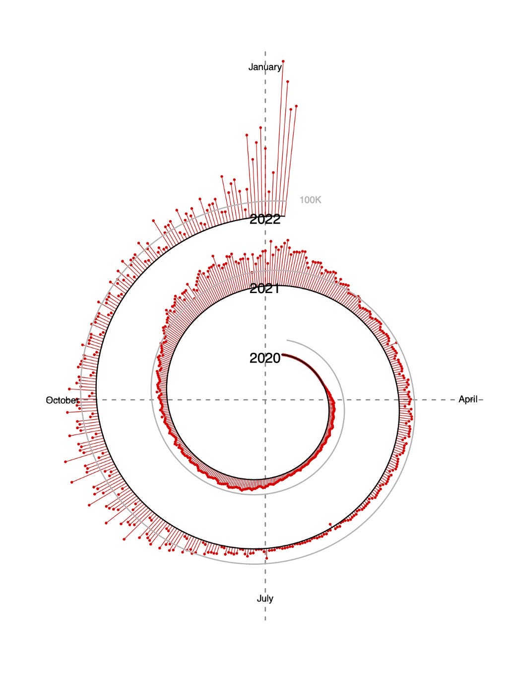
A 🌀 spiralic graph 🌀 of Covid-19 cases over time published yesterday in the New York Times caused quite a stir on Twitter today, at least amongst data visualization practitioners and enthusiasts. Labeled differently, this spiral — otherwise known as a serpent chart, a polar stream graph, or a radial area chart, depending on who you ask — could be depicting the relative interest in information graphics since the Beforetimes. But — especially considering the fact that I work 100% remotely (on a data team), have an introverted personality, and possess a healthy fear of Omicron — my world is about 90% data people. Maybe Regular Twitter didn’t give a hoot.**

Nick Mark, MD (no relation to me), feels especially strongly about this viz. So strongly that on the 7th day of the year, he’s ready to award it the honor of 🏆Worst Visual Representation of Data 2022 🏆. Dr. Mark made some valid points — and provided some other interesting examples of spiral data visualization — in this nine-tweet thread. Edit: I previously embedded the wrong link to Dr. Mark’s tweet thread. It’s been updated as of 1/10/22 at 8 a.m. EST.
Natalie E. Dean, PhD, assistant professor of biostatistics at Emory, framed her response more positively. She also shared this amazing TikTok critique of the viz.
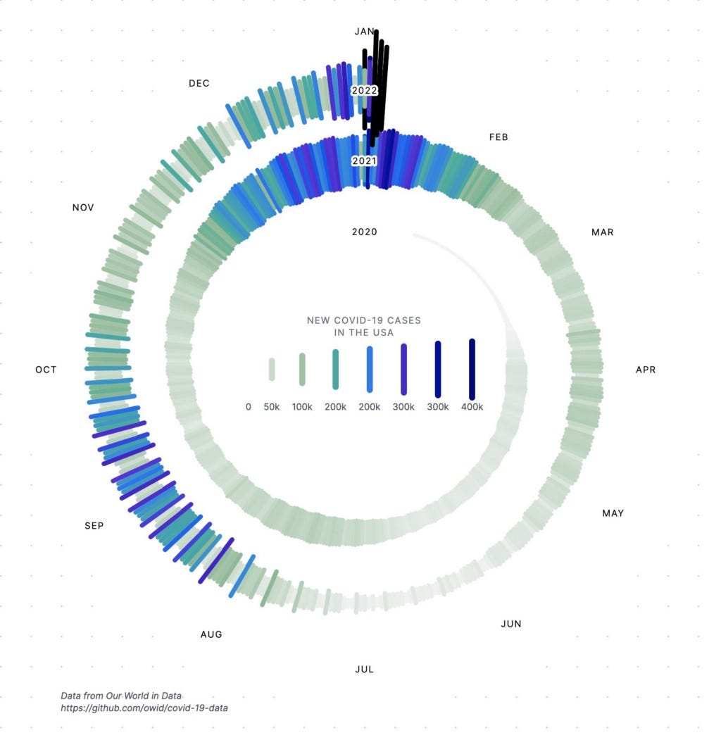
Refreshingly, Amelia Wattenberger offered up a remixed version of the chart of her own making. Her use of color to draw attention to the time periods with peak numbers of cases is very effective, and her month labels are easier to read than the Times’. The legend at the center is nice, too.
Edit (1/9/22): The conversation on Twitter continues! Cédric Scherer, one of my favorite contributors to the dataviz community on Twitter, brought an additional remix of the original NYT graphic to my attention. This one was created by Sourya Shrestha, PhD, a tuberculosis researcher at the Johns Hopkins University Bloomberg School of Public Health. His use of bars is especially effective in showing the recent explosion of Omicron variant cases.
Writing this on Friday evening (shut up! you’re reading this, so you have no social life either!), I literally just got a Slack notification informing me that the controversial chart will be a topic of discussion at Chart Chat on Thursday, January 20. (I always look forward to Chart Chat — now I am 🤩 extra 🤩 looking forward to it!)
What’s my hot take? My initial reaction was, This looks cool, but why is it off center? A regular area chart would’ve worked just fine. Yes, it would have. But would Twitter be ablaze with both accusations of Crimes Against Data Visualization and praise from esteemed datavizzers? The chart is effective and successful precisely because it’s spurred a lively conversation about data literacy, graphicacy, best practices in dataviz, and ultimately put the data itself in front of more people.
Happy new year, folks! (And sign up for 📉 Chart Chat! 📊)
*The corner of the Internet where we data folk hang out, anyway.
**I would’ve gathered the data to report an educated guess regarding the number of mentions the viz got, but Twitter rejected my application for an API key for whatever bullshit reason.
The New York Times viz that divided #DataTwitter was originally published in SELECT * FROM data; on Medium, where people are continuing the conversation by highlighting and responding to this story.