The U.S. midterm elections, visualized
My favorite graphics related to the 2022 midterms

🗳 This week’s Midterm elections in the United States provided yet another opportunity for journalists, analysts, and citizens to assess the state of our republic and to vote accordingly. Exhausted by the past several years of MAGA, domestic terrorism, and blatant incivility among Americans generally, I was elated to learn that voters under 30 turned out in record numbers–the second highest voter turnout for their demographic in at least 30 years. And they’re not just voting against something or someone (Donald Trump): “It’s never been just about Trump for us. It’s about stopping the climate crisis, protecting our reproductive freedoms, and ending gun violence in our classrooms,” Ellen Sciales of the Sunrise Movement told Teen Vogue.
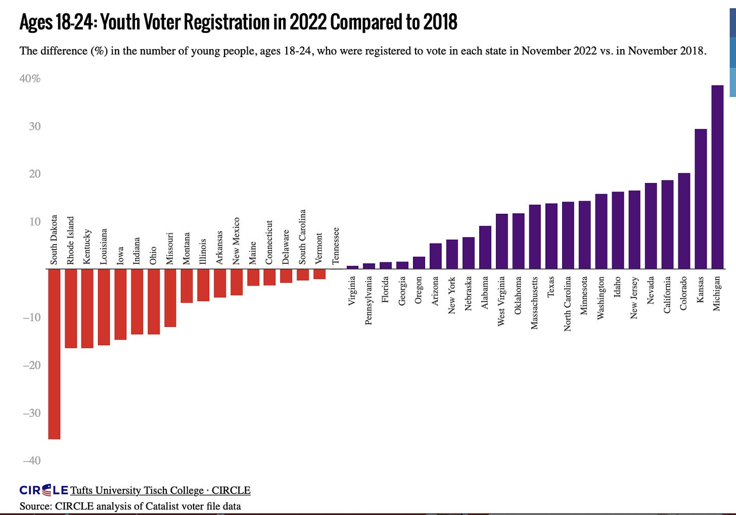
☑️ Voter registrations among eligible U.S. residents ages 18–24 increased from 2018, as visualized below by Tufts University’s Center for Information & Research on Civic Learning and Engagement (CIRCLE). This graph, created in Datawrapper, would be far easier to read if it were just rotated 90 degrees to be a horizontal bar chart rather than a vertical one. I guess they wanted the negative numbers pointing downward, but it’s more important to be able to read the labels. They reveal which states had the biggest increases — notably, some with abortion measures recently on the ballot, like Kansas and Michigan.
🔴 That good news softened the expected blow — data that the politics here in Florida are indeed getting redder and more conservative — visualized by The New York Times. In the map below, the use of red arrow icons pointing to the right in counties where the vote was more Republican than in 2020 (spoiler alert: THAT’S EVERY SINGLE FLORIDA COUNTY) drives the point home in an unsubtle — and slightly unsettling — way.

As of October 11, 2022, registered Democrats outnumbered registered Republicans by 52,530 in Hillsborough County — where I live in the City of Tampa — so it didn’t have to be this way on this side of Tampa Bay.
🗺 The Times’ U.S. counties tilemap revealed that my Congressional District (FL 14) did hang on to our Democratic representative, Kathy Castor.
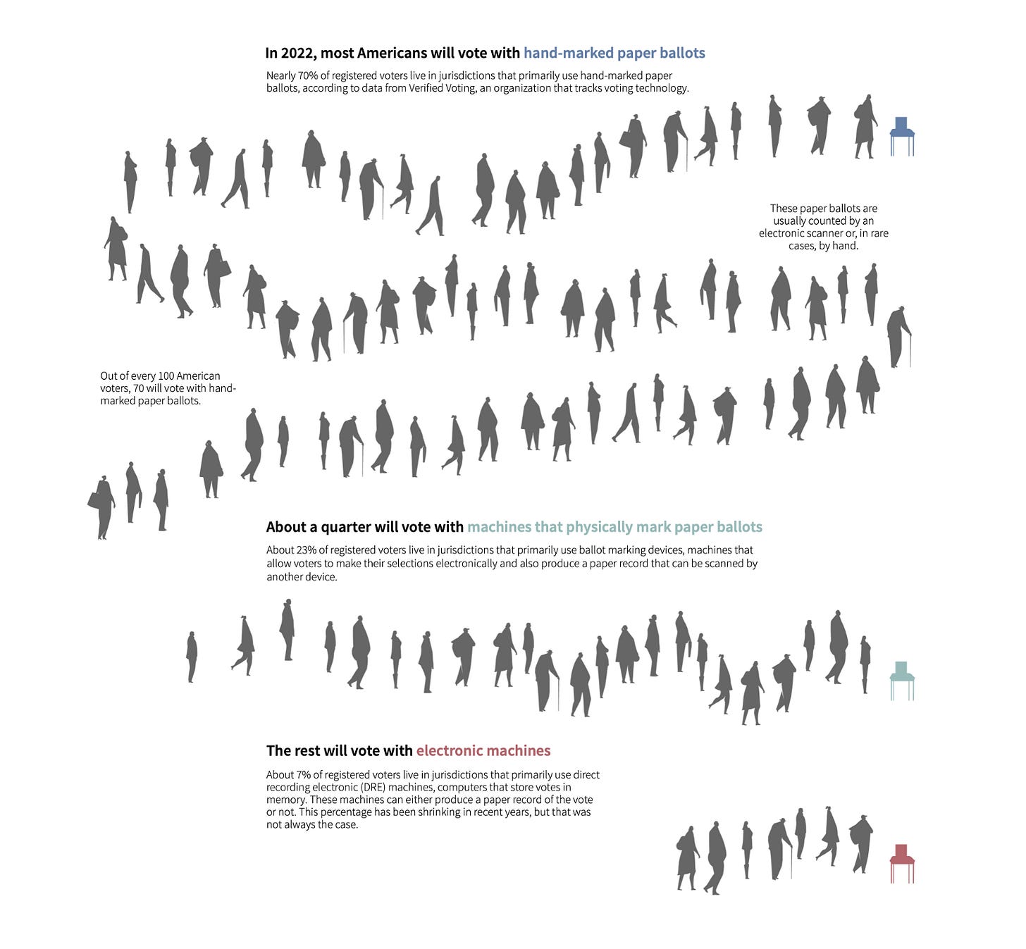
👥 Finally, Reuters explored how Americans vote in 2022 in the engaging visualization below. (I zoomed out to take the screenshot, so check out the web version to see more detail.) This graph works so well because it uses iconic representation of voters.
As Bridget Cogley and Vidya Setlur explain in Functional Aesthetics for Data Visualization (which, if you dataviz, you should be reading):
Iconicity supports familiarity and better chart understanding, especially when the treatment is semantically meaningful. By making the patterns in the representation surface more meaningful to the reader, the chart becomes less abstract. (82)
Which graphics did you find meaningful or insightful this election season? I would love to learn which ones and why.


