


Three Thursday Things 08: Data sources for analysis of social justice topics

Newer data analysts and curious civilians regularly ask me how to obtain data suitable for visualization projects. For super green analysts, I always suggest the archive of Makeover Monday datasets because I’m certain that the files contain clean, ready-to-use data, enabling them to focus on developing visualization skills instead of spending countless hours wrangling data. (Though that’s a skill they should practice, too, just maybe not at the same time.)
For folks with some experience under their belts, I recommend Storytelling with Data’s super helpful collection of publicly available data sources covering a broad swath of topics including government, health, and economics. I always tack on some variation on the following little postscript, though.
Learn to find, collect, and wrangle your own data. Write down the random questions that come to you at those inopportune moments (like when you’re holding downward-facing dog with sweat dripping down your face in a yoga class you didn’t realize was heated until after you arrived). Of the skills and qualities required of a data practitioner, curiosity may be the most important, so pay attention to what questions and topics you’re drawn to. Then the data will find you.
Since this is Three Thursday Things, after all — and frankly, I’m fucking tired, but also trying to stay committed to a regular writing practice — I chose an easy theme for myself (or I initially thought I did): three excellent datasets I’ve explored recently.
🧠⚠️Mental health warning: this post gets depressing, fast, since I’m interested in income inequality, housing, and criminal justice. If you’re already feeling shitty, return at another time or proceed with caution.
🔬Eviction Lab
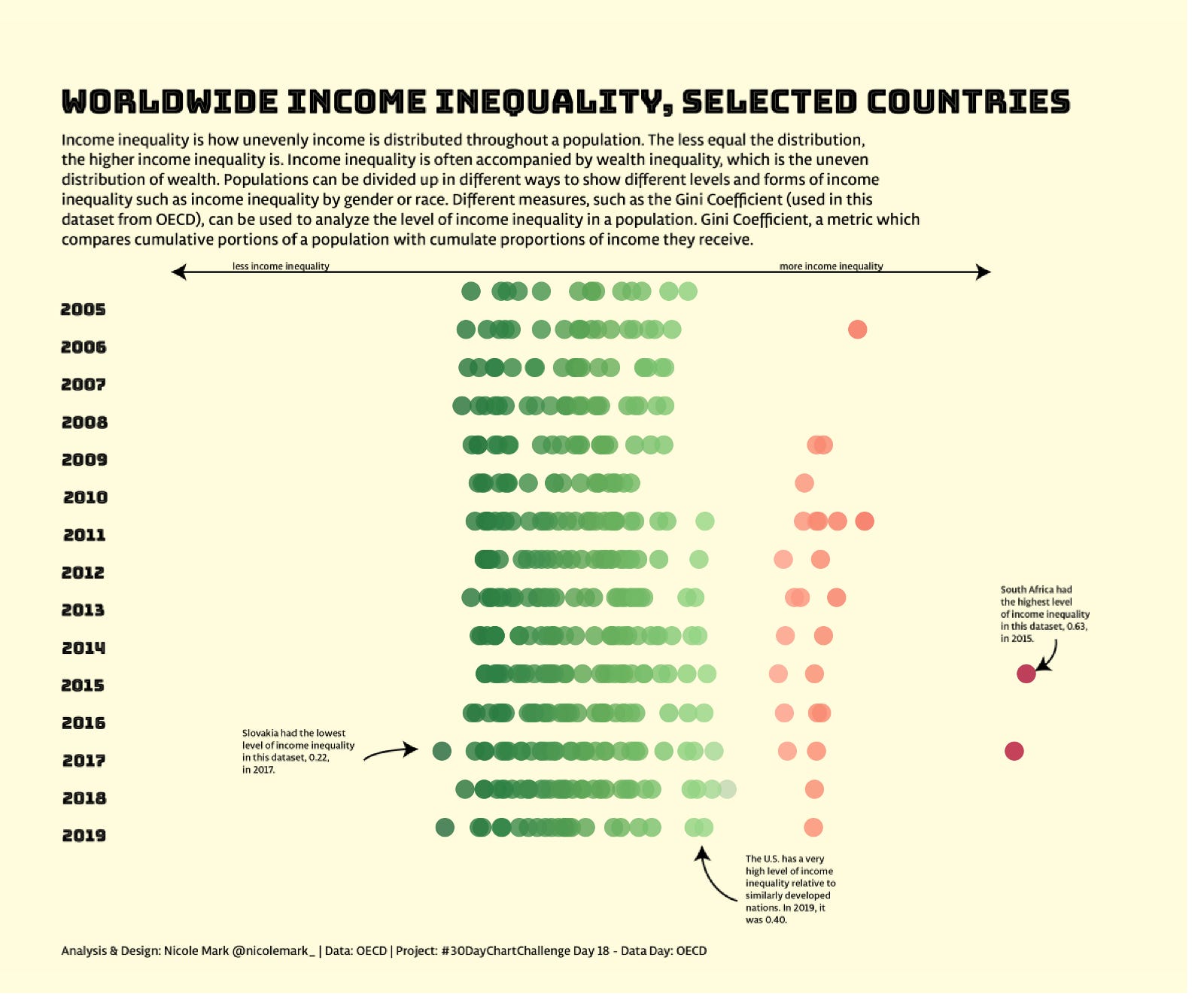
Princeton University’s Eviction Lab studies one of America’s greatest deficiencies as a so-called civil society — poverty disproportionate to our relative wealth. Income inequality greatly troubles me. Earlier this year, for the #30DayChartChallenge, I visualized the unequal distribution of income in countries around the globe. The U.S. level of inequality is disappointing at best.
Inadequate income leads to housing insecurity — and vice versa — in America. Asked why he founded Eviction Lab, Principal Investigator Matthew Desmond said, “eviction functions as a cause, not just a condition of poverty.” I wholeheartedly agree and encourage you to explore their interactive maps and charts, viz some of their modeled or raw data, and follow them on Twitter.

🏡 Zillow Housing Data
I swear I intended to make a cheeky joke about my fascination with the real estate market and obsession with HGTV and shltr’s Instagram account prior to suggesting Zillow as a data source, but here we are. I just happened to notice that Zillow had a chart related to eviction profit and loss and my heart sunk, nearly certain I’d be looking at cold capitalism at its most cruel. But data is wonderful this way — it sometimes surprises us and completely contradicts our gut feeling. Zillow actually found that landlords profit less when they evict a tenant for non-payment of rent versus making a repayment agreement with them.

Real estate fascinates me, so I explore Zillow’s home values, inventory, sales price, list price, and forecast data regularly.
⚖️The National Archive of Criminal Justice Data
Trying to find out last year’s mean federal prison sentence in months for kidnapping? Arrests by race and age in 2004? The National Archive of Criminal Justice Data (NACJD) has you covered with thousands of datasets, many spanning decades.
Ideally, when choosing my own data for visualization purposes, I prefer to know the level of granularity, number of observations, shape of the data, and data collection methodology prior to really digging in to the dataset. NACJD provides an online analysis tool, allowing for quick and easy exploratory data analysis and downloads in SPSS, SAS, Stata, and delimited formats. Follow them on Twitter to learn about new dataset releases as soon as they’re available.
thanks for ‟where to find data: an incomplete list”