


UX x Dataviz: Mental Models
NOT the final installment of a three-part series on good UX in dataviz but headed in that direction.

I planned to write the third and final installment of Seven principles of UX design to improve your business data visualizations this weekend (here is part 1 and here is part 2), wherein I set out to define what makes a “good” user experience in data visualization, focusing on interactive business dashboards. Writing the introductory paragraph, I realized I needed to take a detour back to the concept of mental models introduced in part 2. So consider this part 2.5.

What are mental models again?
Recently, I made the argument that we should try to design according to existing mental models most of the time, rather than being “driven by a desire to capture an audience’s attention with something shiny and new or with a chart that’s technically challenging to build.” Last week, I did THAT EXACT THING I told you not to do. At work. On a business dashboard. The exact context in which I made that recommendation to YOU. My colleague kindly steered my toward a simpler visual, thankfully. I’m telling you this boring work anecdote because I want to drive home the fact that this particular pitfall is so easy to fall into, that I can write about it, think about it, and intend to follow through with it in my work, but STILL do it anyway.
I found myself considering mental models again after I stumbled across Farnam Street’s explainer last weekend:
Mental models are how we understand the world. Not only do they shape what we think and how we understand but they shape the connections and opportunities that we see. Mental models are how we simplify complexity, why we consider some things more relevant than others, and how we reason.
They simplify complexity, which is one of the primary aims of data visualization. Data visualizations often encourage the audience to consider some things more relevant than others, too (which may or may not be problematic, depending on the context and intentions of the dataviz author, but that’s a rabbit hole for another post, maybe part 2.75.)
The role of mental models in understanding complex or unfamiliar chart types
Last Thursday, a new installment of the Substack newsletter FILWD, authored by Enrico Bertini of Northeastern University’s Data Visualization Lab, arrived in my inbox. (Northeastern was the first and is now one of the only schools, along with my hometown’s own MICA, offering master’s level education in data visualization.) This most recent post poses the question, What makes a data visualization confusing? Bertini goes on to give some examples and lay out some theories in response. He writes,
If we look at this problem under the lens of mental models, we can hypothesize that confusing graphs are visual representations for which it is hard to build an accurate mental model; that is, the model we make does not match how the graph works. One hypothesis I have is that they evoke the wrong analogies, either because there is a mismatch between the visual representation and the information they represent or because there is a clash with mental models of similar representations we have acquired in the past.
Bertini’s first confusing-chart example is perfect: the connected scatterplot, a cross between a scatterplot and a time series showing two variables over time. (Definition adapted from FlowingData.) Despite my familiarity with the chart type, even the best examples of it, such as the two below, require extra cognitive effort on my part to read and understand. (My theory as to why: we are used to reading line charts from left to right, like we read, and the connected scatterplot sometimes takes us back to the left when we are not expecting it, which can be cognitively jarring.) I can imagine it takes even greater cognitive effort for a general audience.
One excellent example, below, was created by Hannah Fairfield, then of the New York Times Graphics Department — now the climate editor — and published in May, 2010. It’s about gas prices — some things never change. (Tangential, but worth mentioning, is Fairfield’s talk, The Power of the Reveal in Data Visualization, also by way of FlowingData.)
The example Bernini used, from another distinguished data visualization designer, Jon Schwabish of PolicyViz, is pictured below. (He also has a podcast of the same name, which I highly recommend.) From Data to Viz shows some simpler versions of this chart type and does a good job explaining what it’s doing and why. It includes another example from the New York Times Graphics Department, also by Hannah Fairfield, which uses arrows to direct the reader’s attention.
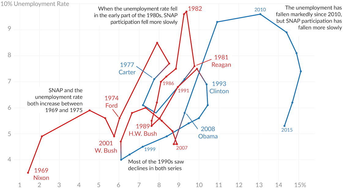
Jon Schwabish didn’t set out to confuse his audience. He had a good reason for using this chart type: “I didn’t want to do side-by-side line charts because the correlation is important,” he wrote, which brings me to the most important point I want to make in this post:
We must make decisions as we design and build data visualizations, and those decisions almost always involve tradeoffs.
We must consider the tradeoffs, decide, and then forge ahead, ready — as Jon was — to defend our choice with a rational argument.
Schwabish’s connected scatterplot above was originally published in a 2016 piece for The Urban Institute, “Why presidents have limited influence over the economy” (as timely a topic today as ever, like gas prices). In context, this chart was the perfect choice! Asshole Donald Trump, long before his attempted subversion of our entire democracy, used a group of misleading charts to blame several economic issues during his presidency on actually presidential President Barack Obama. (I’d link to the tweet, but Twitter says “this user’s account is suspended.” 🤣) As we can see from Jon’s well-annotated plot, these economic issues aren’t simple enough to be blamed on one president. The issue was too complex to be addressed in either a tweet or a pair of line charts. When the issue at hand is even more critical for audiences to understand — like visualizations of COVID-19 forecasts — the consequences of our design choices become that much weightier.
Mental models in action
Autumn Baatani, a superbly talented data visualization designer, recently published the insurance claims dashboard whose landing page is pictured below. Visit the interactive version on Tableau Public to experience for yourself.

Particularly when designing a standalone dashboard about a specific topic, a landing page works especially well to organize the content and provide the cohesion I was talking about in part 1 of the series I am not completing right now. Autumn’s viz even has personalized greeting, much like you’d expect to see when you log in to any web portal. It fits into an existing mental model already, and I’ve barely started exploring it. Your three navigation choices are clear, and if you need to know the data source or recency of the data, you can just hover over the question mark. Imagine how frustrated you would be if this question mark didn’t do anything, but was just decorative. This simplicity at the start exemplifies what Farnam Street calls the mental model of First Principles Thinking.
Reasoning by first principles removes the impurity of assumptions and conventions.
No prior knowledge of insurance claims or data visualization is required to understand how to navigate Autumn’s dashboard. If you’ve visited any websites this century, you know what to do. I’ll revisit this dashboard when I actually, for real, I-promise-this-time, definitely, absolutely write part 3 next weekend.
I love this quote: "Data visualizations often encourage the audience to consider some things more relevant than others..." I think that data visualization tools are some of the most exciting ways we have of telling stories and sharing ideas. And, they are a tool. As such, I think it is as important to question the assumptions and ideas that drive the graphic and the choices that go into the creation of that graphic as it is to question the underlying data. I also think that better understanding how visuals work (and the ways they don't) is an important digital literacy skill. I have been learning a lot from your posts. Thank you.